
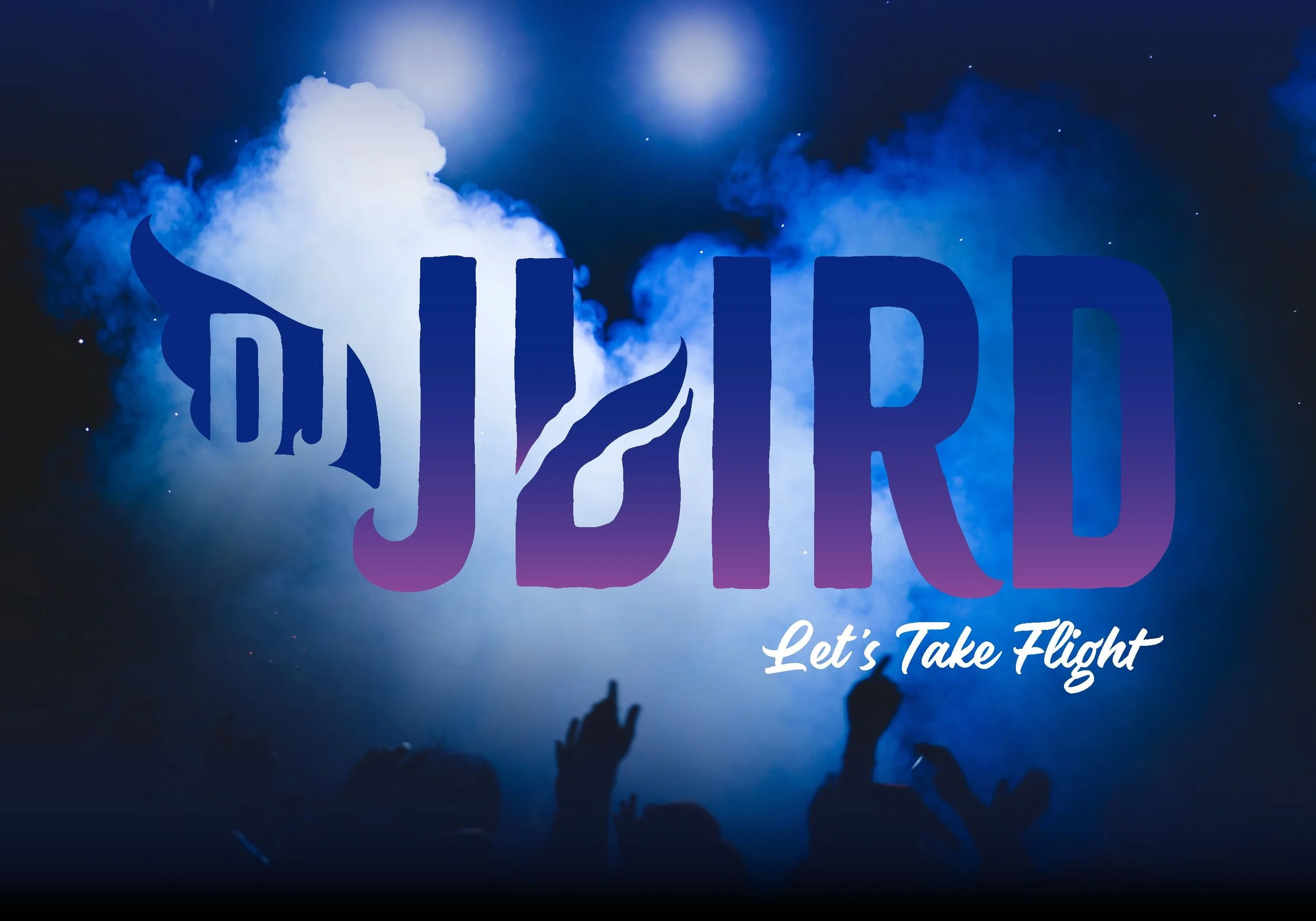
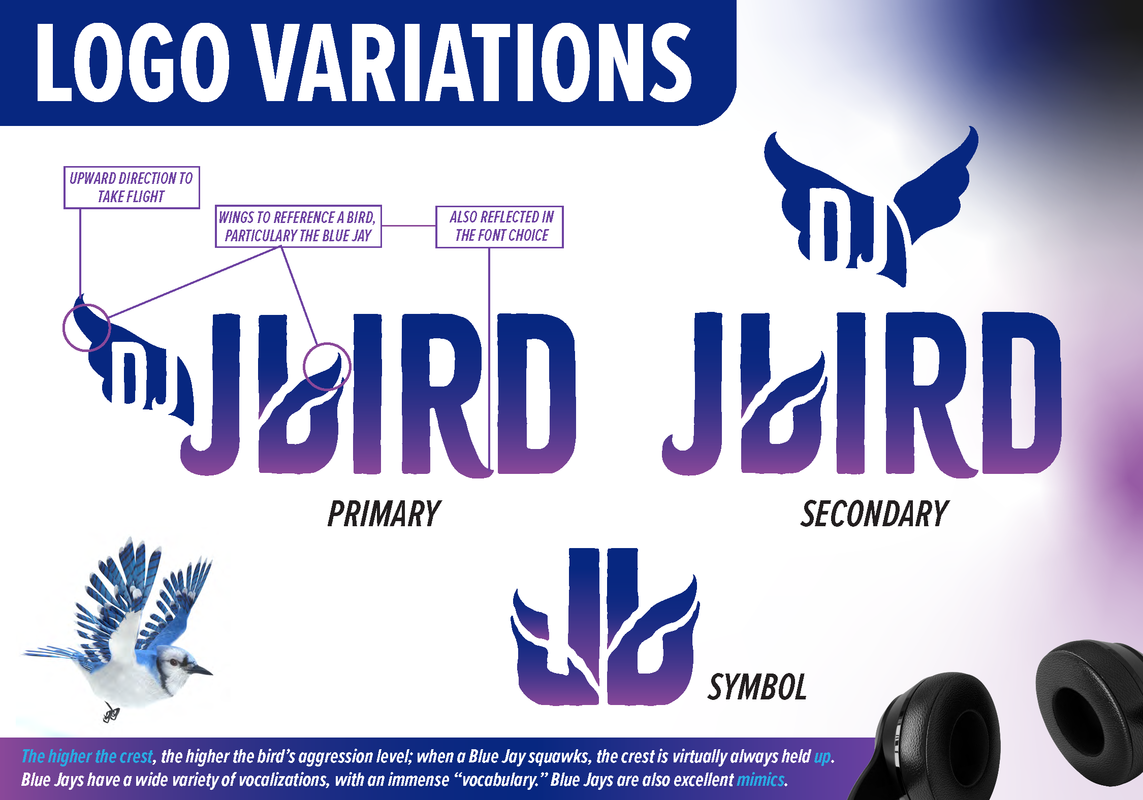
DJ JBIRD
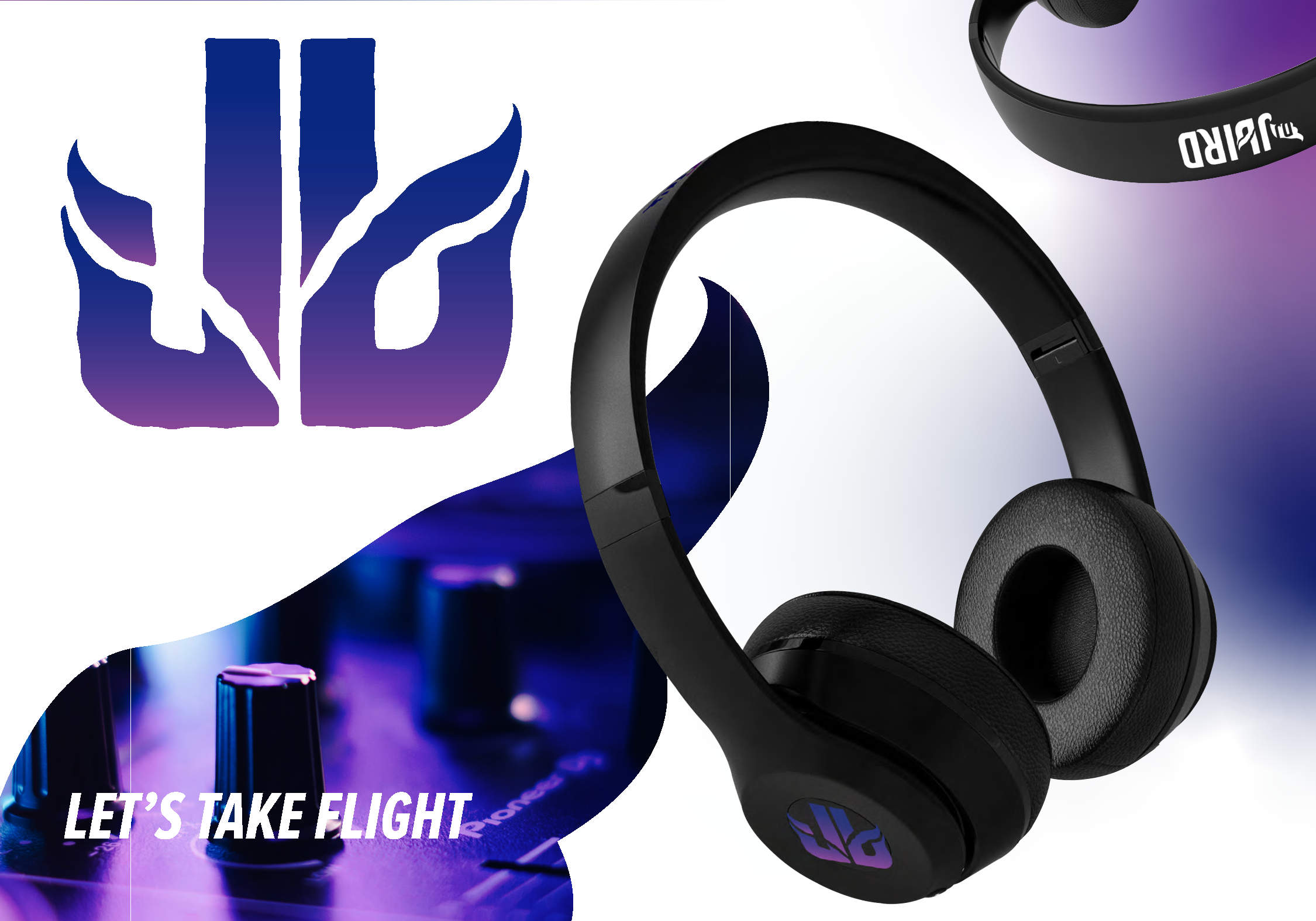
Let’s Take Flight
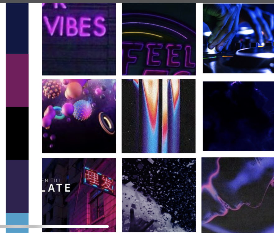
DJ JBird is a mobile DJ based in one of the most southern parts of Mississippi. He is passionate about curating a positive vibe and creates that ambiance through music. DJ JBird not only wants to focus heavily on the type of atmosphere he creates but also wants to showcase his professionalism and electric personality - something that sets him apart from his competition.
Problem
The client needed a bold and recognizable logo that reflected their DJ identity while visually connecting to the “Bird” name.
Constraints
The design needed to incorporate bird symbolism, remain legible at small sizes, and work across multiple platforms such as social media, promotional materials, and merchandise.
Decision
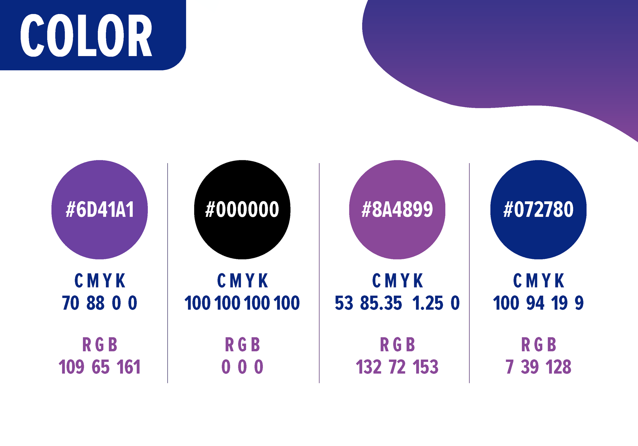
I integrated wing shapes into the typography and used upward motion to suggest flight and energy. A blue-to-purple gradient references the Blue Jay inspiration and nightlife atmosphere while creating visual impact.
Outcome
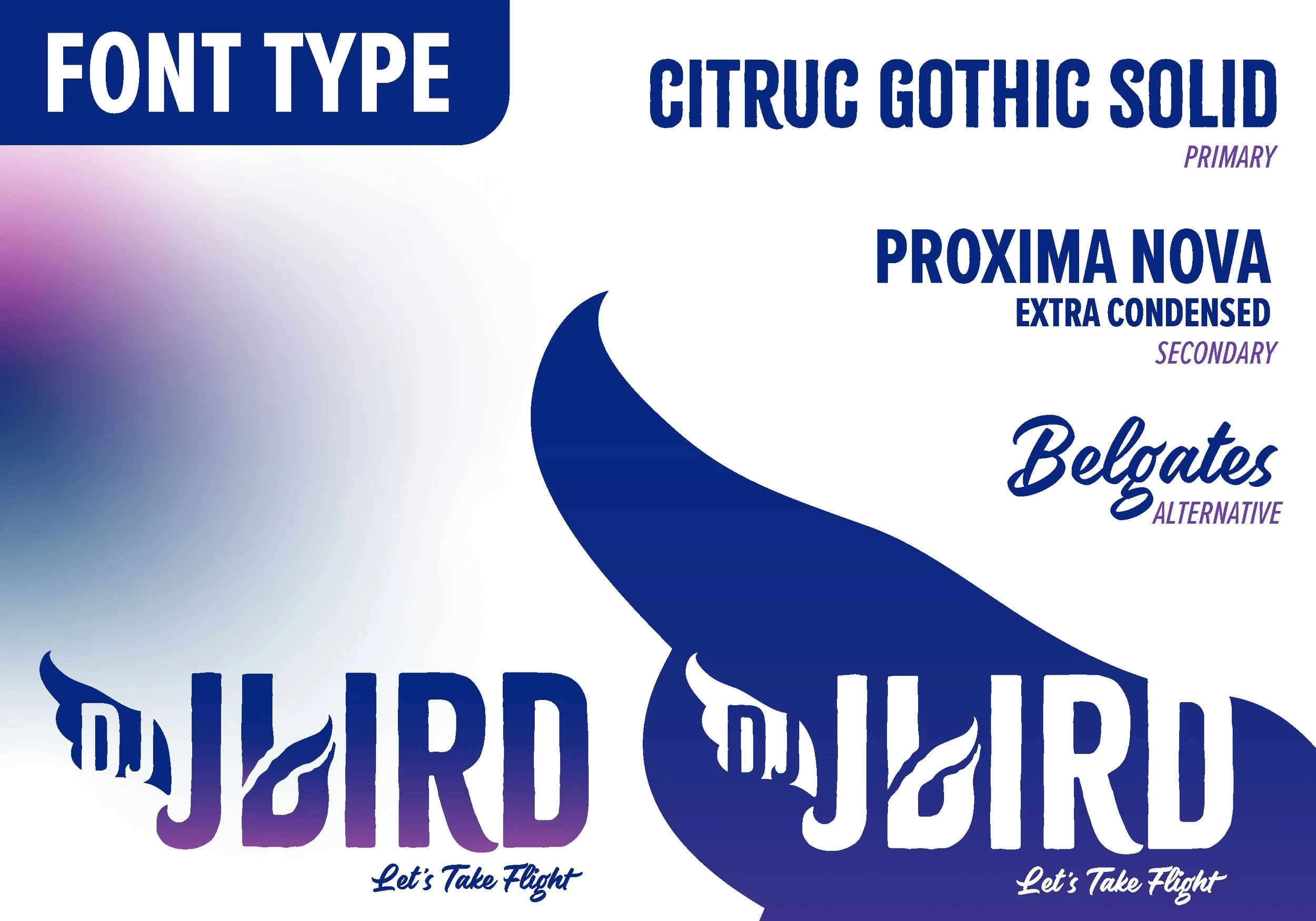
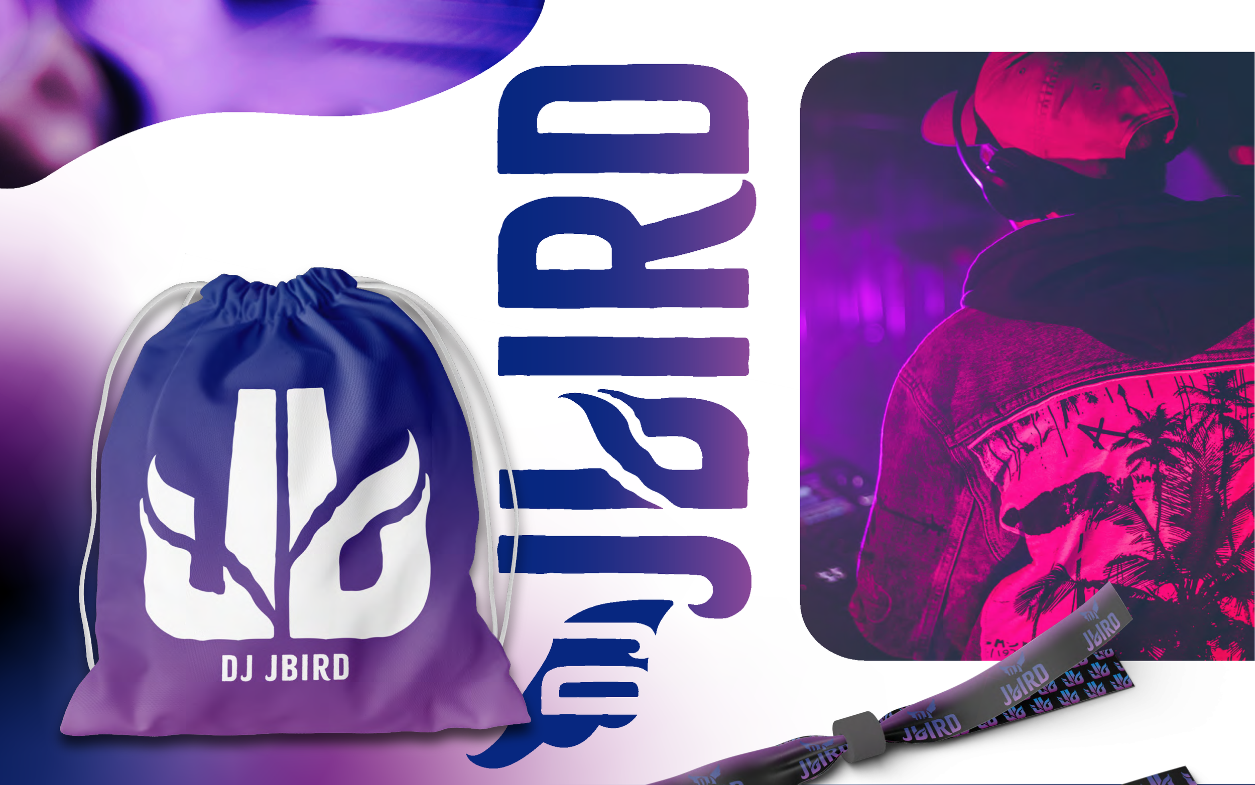
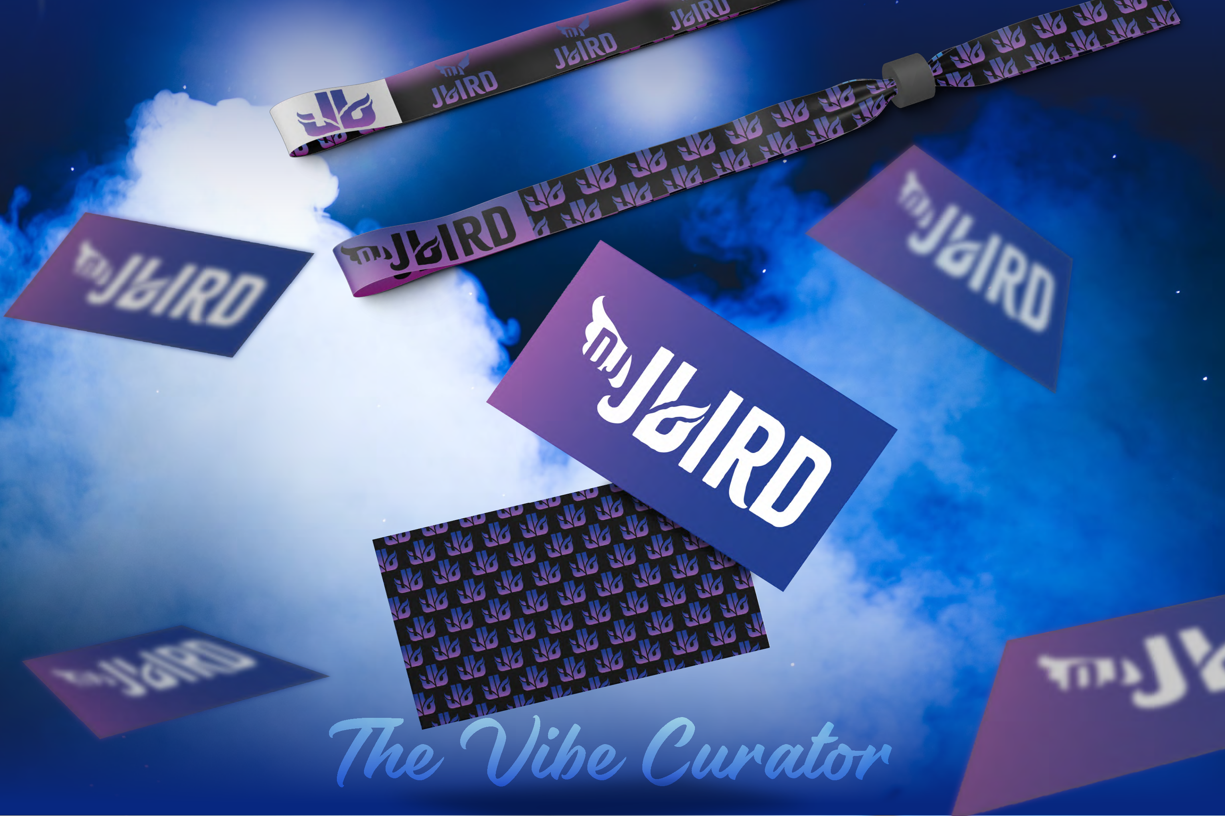
The final design produced a flexible logo system including a primary logo, secondary variation, and standalone symbol that allows the brand to remain consistent and recognizable across different applications.
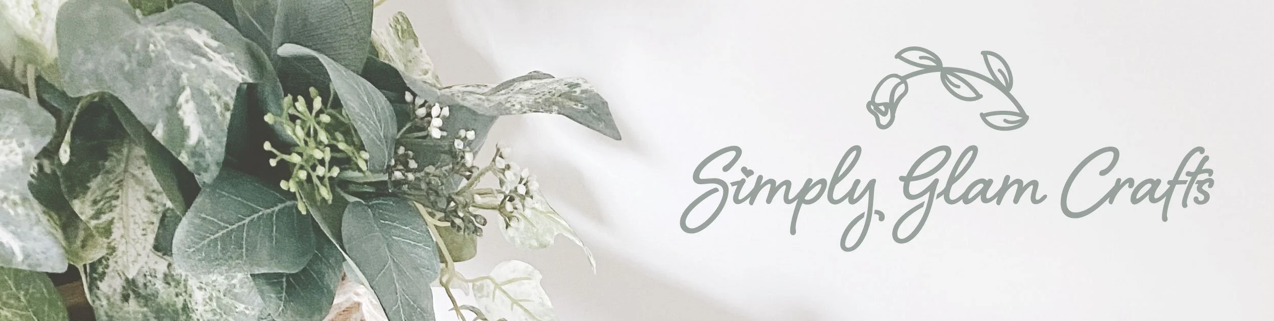
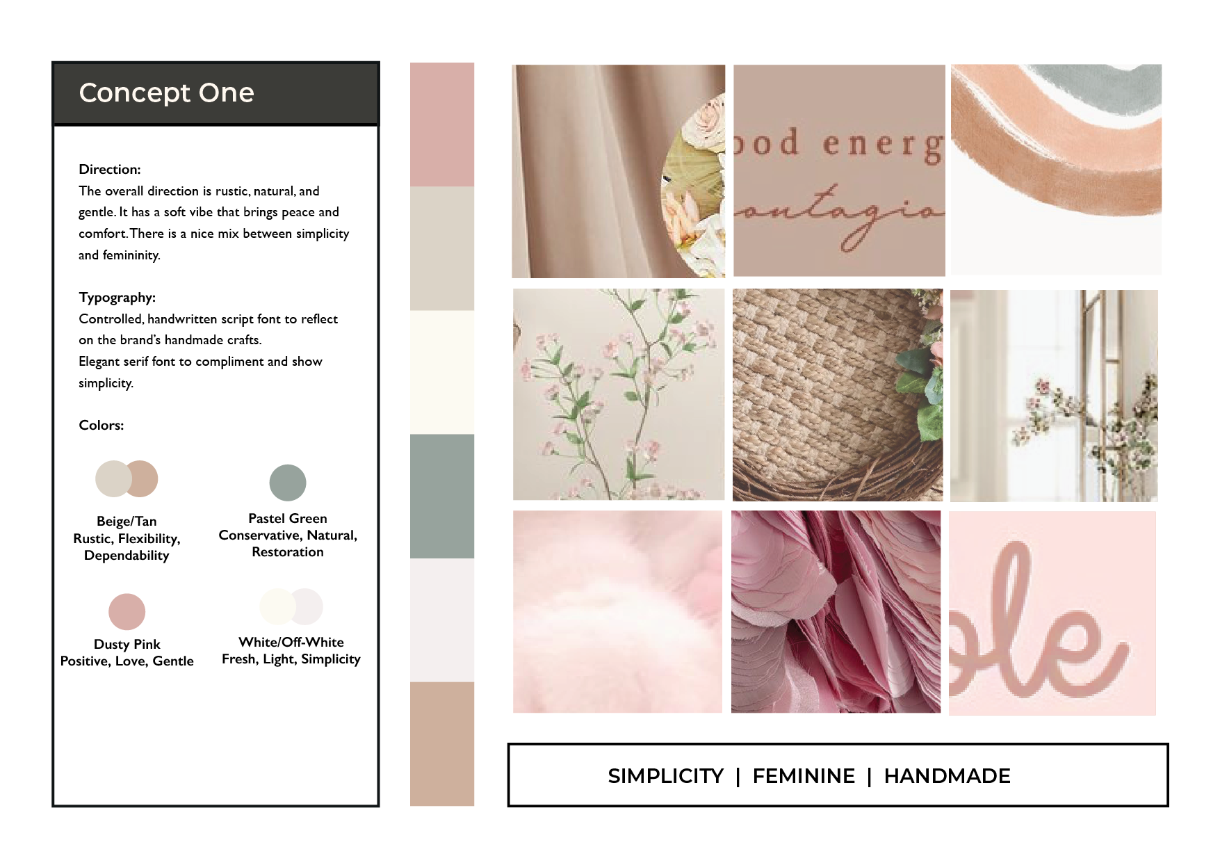
SIMPLY GLAM CRAFTS
The Handmade Home Experience
A cohesive brand identity for a handmade craft boutique centered around simplicity, femininity, and the beauty of everyday home moments.
Brand Attributes
Simplicity • Feminine • Handmade • Warm
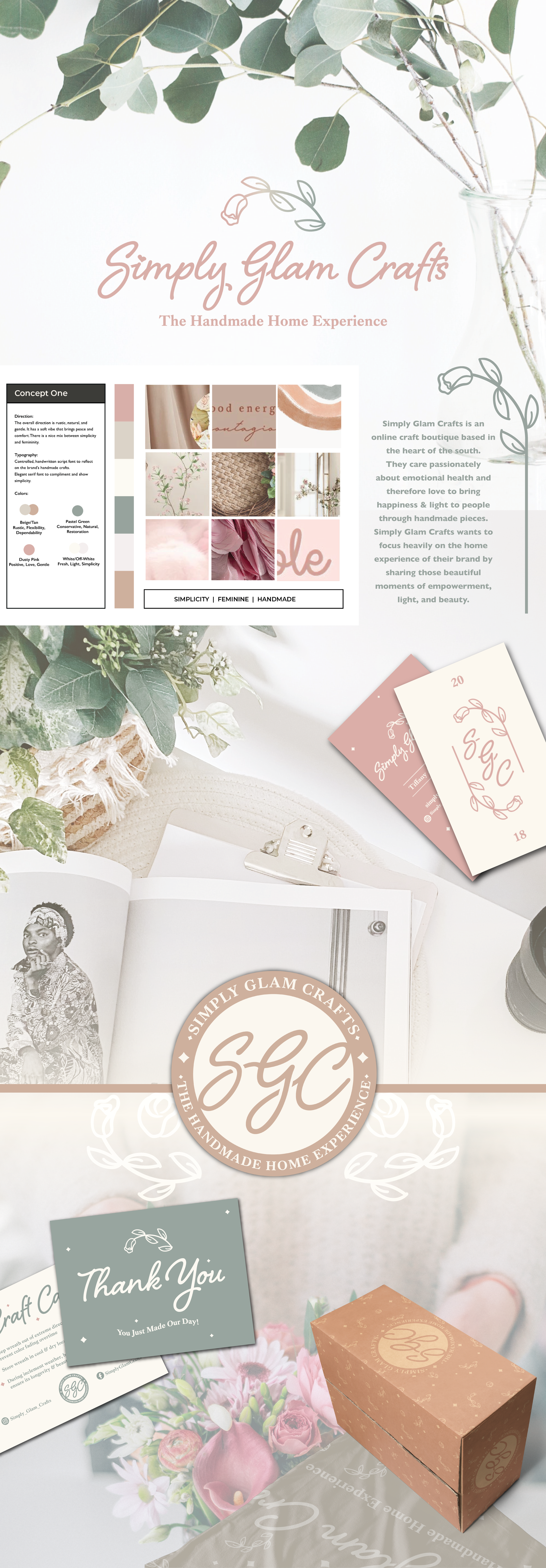
Problem
The client needed a cohesive brand identity for an online craft boutique that reflected the warmth, creativity, and emotional connection of handmade goods.
Constraints
The brand needed to feel feminine, approachable, and natural while remaining flexible enough to work across digital platforms, packaging, and printed materials.
Decision
I developed a soft color palette and delicate floral iconography paired with elegant script typography to reflect the handmade, heartfelt nature of the brand. Supporting brand elements and patterns were created to maintain consistency across packaging and marketing materials.
Outcome
The final result is a cohesive brand system that communicates warmth and simplicity while giving the business a recognizable identity across its website, packaging, and customer touchpoints.
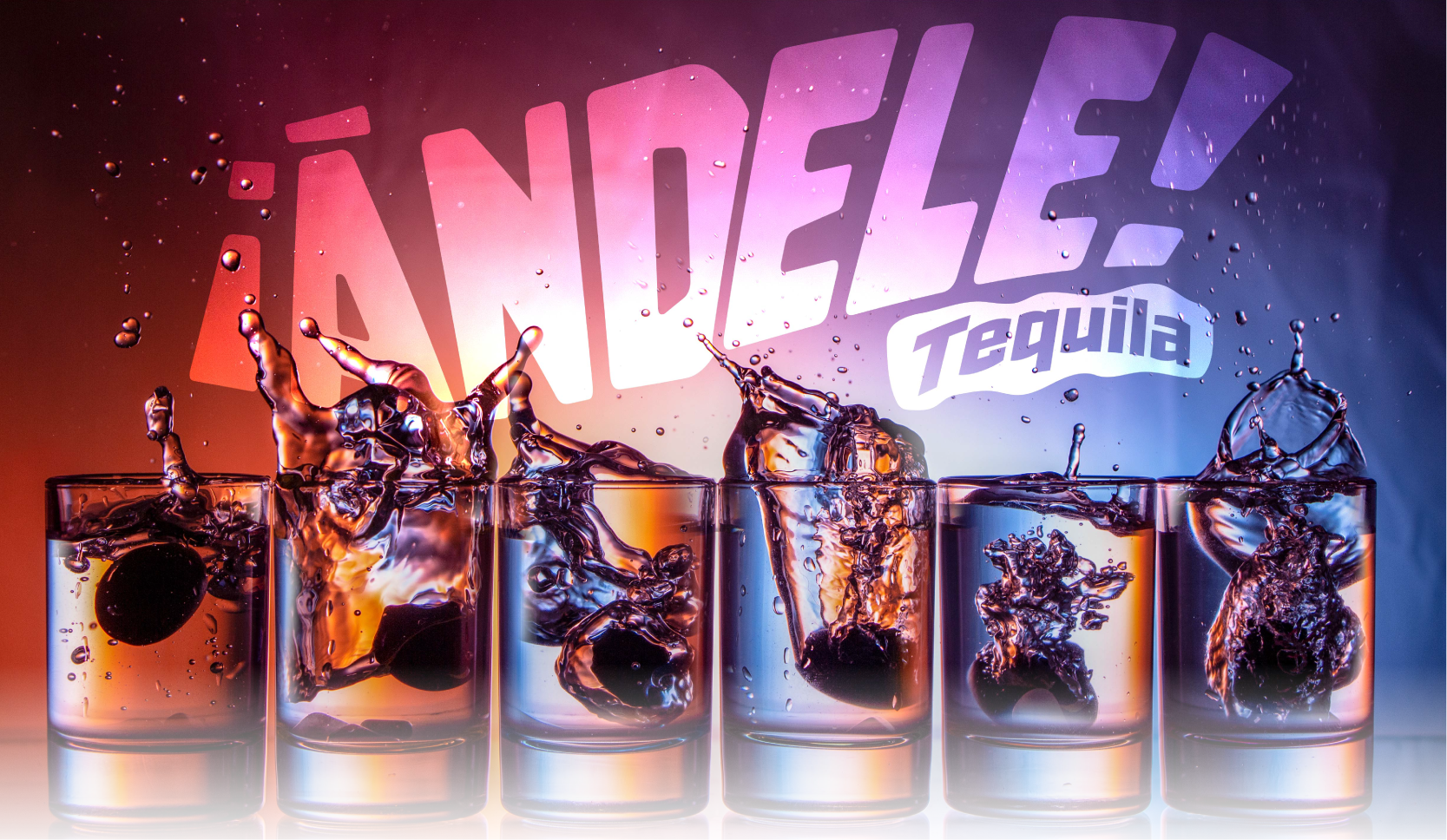
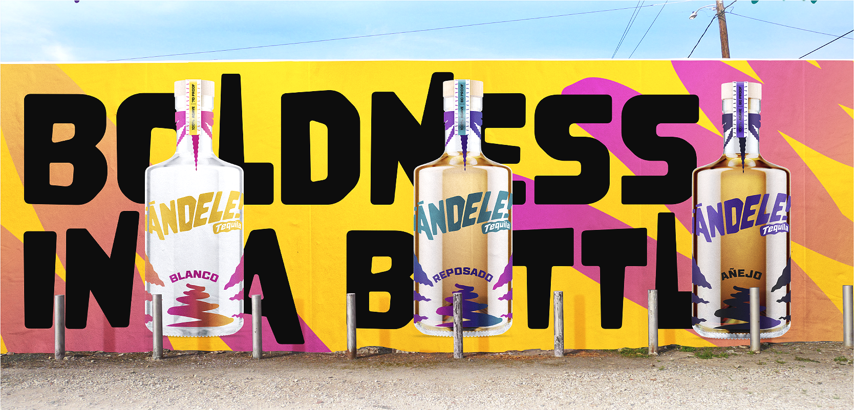
Big Ideas, Real Impact.
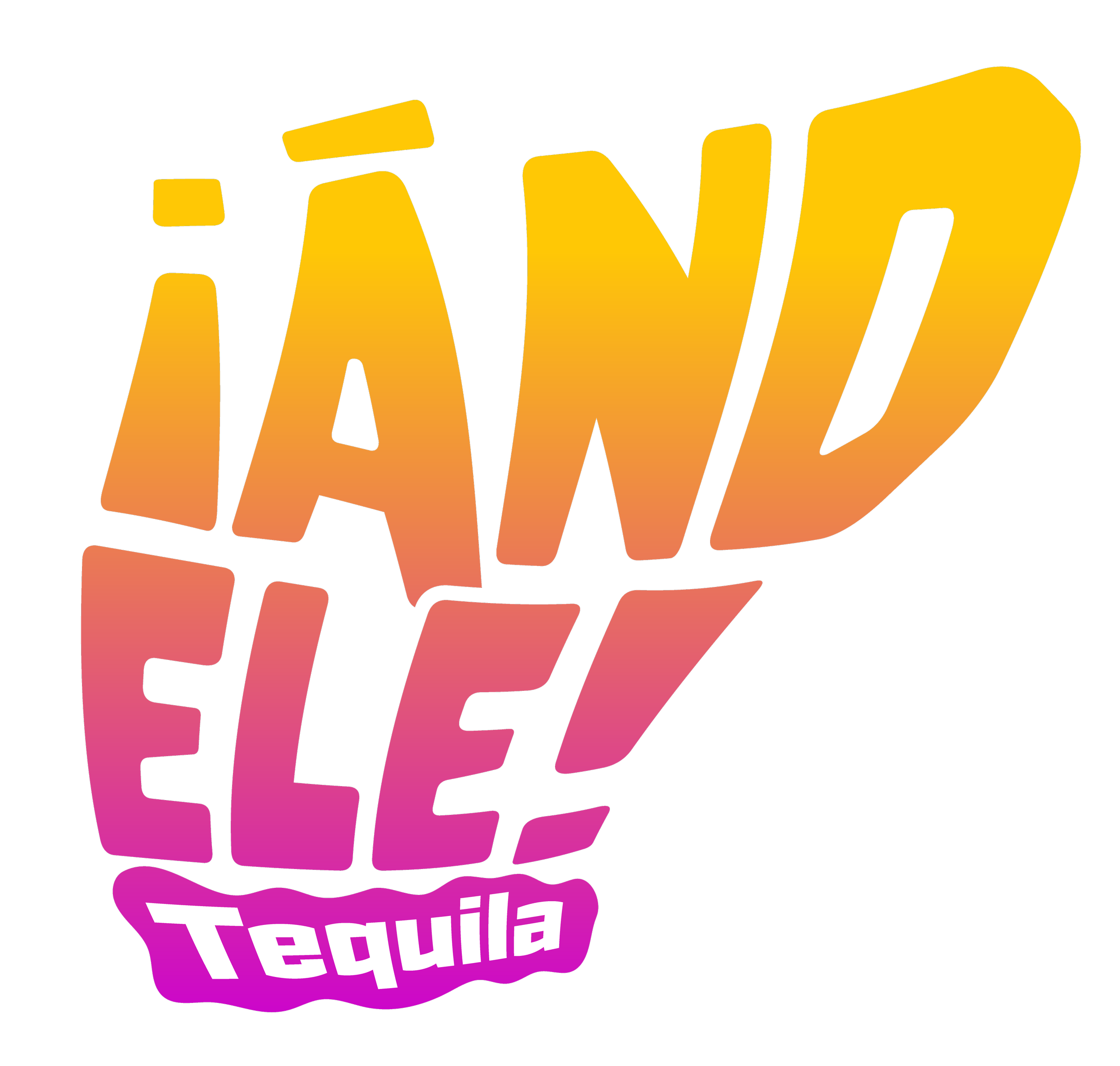
Problem
The goal was to create a bold and distinctive tequila brand that stands out in a saturated market while capturing a sense of energy, culture, and celebration.
Constraints
The brand needed to feel vibrant and memorable while clearly differentiating between product variations (Blanco, Reposado, Añejo). It also had to translate across packaging, large-scale graphics, and promotional materials.
Decision
I developed a high-energy visual identity using bold typography, vibrant gradients, and expressive graphic elements inspired by movement and impact. A flexible color system was created to distinguish each tequila type while maintaining overall brand consistency across packaging and environmental applications.
Outcome
The final result is a dynamic and cohesive brand system that stands out visually across bottles, packaging, and large-scale graphics, creating a strong and memorable presence both on shelves and in promotional spaces.